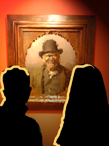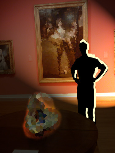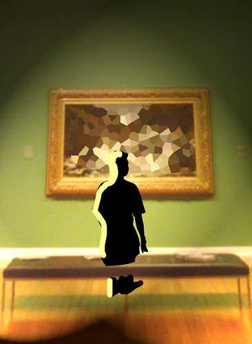
For my Dunedin Public Art Gallery shoot, I started with some recce pictures taken on my phone, the HTC Magic. Saves me lugging my kit to the location when I don't really need to, and the file sizes are reasonably small. The only downside is that in low light situations, phone cameras need steady hands to avoid blur; no biggie.
Back at the lab, I import the shots into CS3 and start work. First thing I did with these was to obscure the works with a mosaic filter - gotta respect other peoples intellectual property, even when they're long dead. I'll show the finished shots as soon as I know from the gallery that they're clear to use. Next, if I'm using a model, I'll pop a figure into a new PS layer. Since I'm an abysmal artist, I use silhouette vectors. There's a great selection free to use here.

Finally I add the lighting effects I'm looking to achieve. This is the part that really helps me when it comes to the shoot. It means I've thought out my light placement, lighting ratios and the places where I don't want light to fall, so on the day I can go straight for the combination of lights, modifiers and stands I need. To do this in CS3, I use the Render/Lighting effects filter, a great little tool for this job. If you're lighting more than one part of the frame separately, it takes a few layers to get things looking right, but the effort is worth it. I use the paintbrush tool to draw rim light on my silhouettes, and I'm done. It's not perfect, but it's enough to communicate my ideas with.
I send a copy to the client to check I'm on the right track, and load the pre-visualisations back onto my phone so I've got a handy reference in my pocket. In this case, Tim at the Gallery told me one of the works I planned to use was going to be a pain for him to clear in time for the publication he was planning, so that was one setup scratched. Thankfully he liked my plans for the others, so on the day we got what we planned, and had time to experiment with a couple of other ideas Tim had. Happy client. Happy Photog.


No comments:
Post a Comment