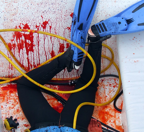
This shoot was different though. We were recreating grisly shark attacks up in the waters off Tutukaka, so we had a gripping subject. Without the pressure of directing the action and shooting, I was free to concentrate on getting stills of it all. One day we were filming this action moment when our actor was being pulled into a boat, rigged with blood packs to splatter as he landed on deck. I had one thing in mind about my previous work: As well as the bad focus and poor lighting, lots of my pictures were of objects that were too small in frame. I needed to work on filling the frame with my subject. That was what I was concentrating on. I was in a good position, ready for the shot. When it all happened, the whole crew knew we'd gotten a great moment on tape. I got this:

(You can click on the picture to go to my flickr stream and see more)
I wasn't sure if it was any good, but I knew I liked it. A lot. With my confidence boosted, and a new digital camera that I could afford to make lots of mistakes on, I shot a lot more pictures. They may not have been great pictures, but they were vastly better than anything I'd done before.
After the shoot I began to read about photography and figure out what I'd gotten right or wrong. The easy answer was that I had a strong subject and filled the frame with it for a change. But I discovered from later reading that other factors were at work. Firstly, it was a picture that told a story, and got the viewer to ask questions. A diver with some horrendous injury and blood loss. Who is it? How did this happen? What's going to happen next? All that gets a big tick in this writer's book. Next, there were the simple primary colours - red blue and yellow against the white of the deck. Then the nice graphic shapes - the triangles of the legs and fins, the curves of the air hose. And finally those little details - the blood spatter pattern, the wounded hand, the mouthpiece.
That was it. I began my journey to understand what makes a good picture, and hopefully, to start taking some.

No comments:
Post a Comment