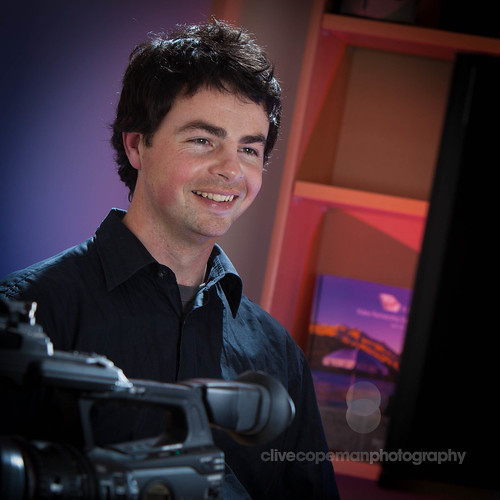
The main need here was a relaxed, professional demeanor and a hint of the company's blue and yellow brand. So I used a blue gel on my white seamless background and colour temperature orange gels as rim lights. Wouldn't you know it though, by the time Nik got to town, the original blue gel I used had been shredded and the other I had, while looking similar, gave a distinctly different hue. Photoshop to the rescue.
Just for a change, I decided to do a little video clip to run you through just a few details of the shoot. I get a little tongue-tied here and there, and mix up the odd term in my effort to be truly spontaneous, but you get the picture. I'm not kidding when I say micro studio, so you'll understand when Joe occasionally bumps the mic against a lightstand or something, it's the first time at something like this for both of us. Enjoy.
We decided to use environmental shots on the website for our production team - more of a 'working' look. Those pictures are still a work in progress, but I did manage to whip something up of our editor Joe at his station. Red and blue gels on the background, a little bare bulb for hair light, and a white card on his screen bouncing light into his face. Much better than the bare fluoros of the office, believe me.


No comments:
Post a Comment